


19 October 2017
Revitalized and modern: meet our new brand!
The Saskatchewan Abilities Council has been a staple in the province since its inception in 1950. Much like the province, our non-profit organization has evolved, grown and created a space of inclusion, trust and acceptance over time. Our mandate and name, originally the Saskatchewan Council for Crippled Children, have also reflcted this progress. Our focus on ability has guided much of what we do as an organization, helping us support countless children, youth and adults experiencing disability to enhance their independence and participation in the community.
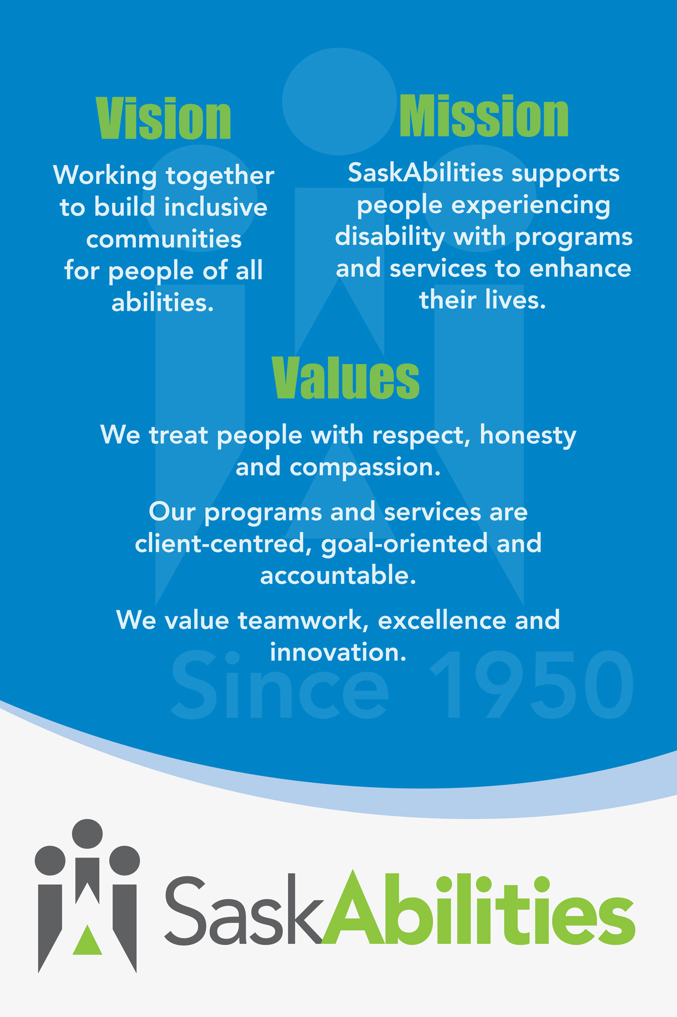
To ensure we are meeting the needs of the community, we continually evaluate our programs and services to ensure our vision, mission and values are reflective of those needs. With this in mind, we have decided it’s time for a change.
After thoughtful consideration and a lot of discussion with our Board of Directors, we are pleased to share exciting changes to the Saskatchewan Abilities Council’s operating name and logo as well as our vision and mission.
The Saskatchewan Abilities Council is a recognizable non-profit organization across Saskatchewan and beyond. With a long history that garners a strong brand recognition and positioning, we could not deny the value in keeping a name that so simply explains who we are and who we serve. SaskAbilities is a more modern, streamlined version of our name that still maintains a respectful nod to our history and roots in the community.
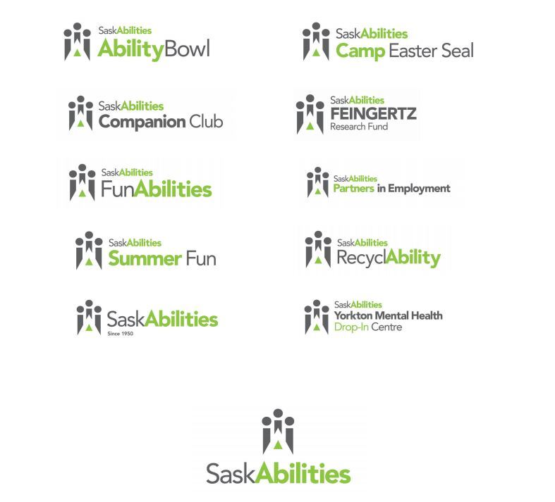
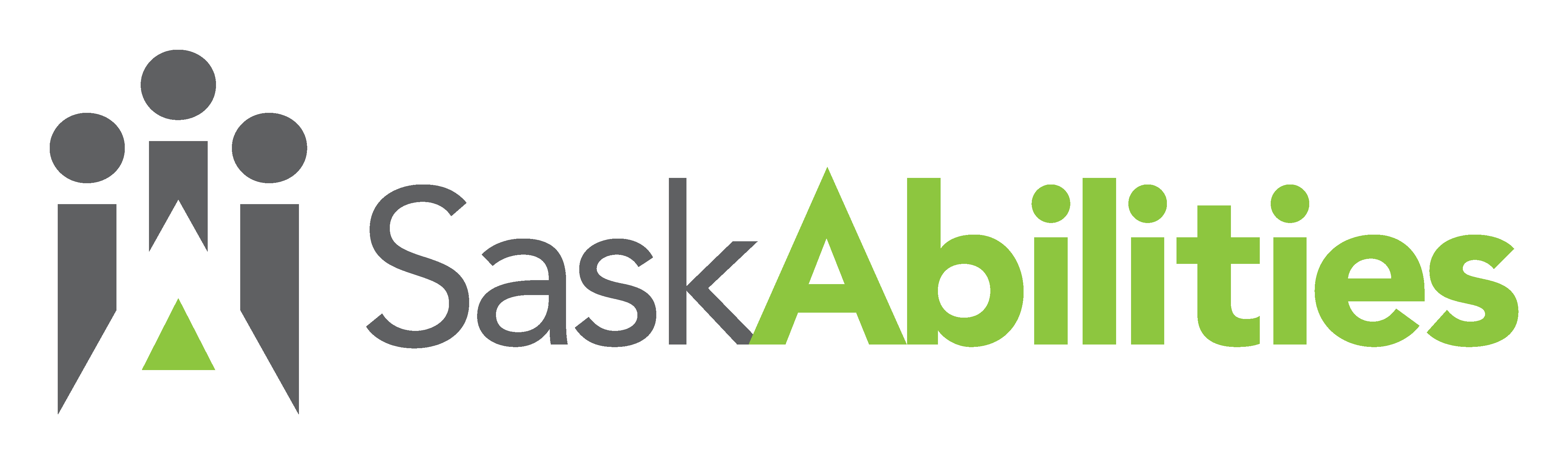
To capture the essence of inclusion, equality and community, our revitalized logo signifies our renewed vision and mission. From the letter A visible within the logo to the word Abilities intentionally bold, our focus on abilities is emphasized throughout the new logo. Also at the heart of the work we do are the individuals we support and the community that supports us. Surrounding the A are three symbolic figures representing an inclusive community.
The colours chosen for the new SaskAbilities logo are fresh and modern. The charcoal grey stands for stability and trust, while the green represents renewal, growth and well-being. Green naturally resonates with rejuvenation of the SaskAbilities image, bringing a sense of energy and vitality into our work.
Unveiling the new SaskAbilities name and logo is an exciting moment for our organization, one we are proud to share with you. As we continue our work in the community, strong brand recognition will unify the many SaskAbilities programs, services and products.
By integrating the growth and expertise gained in these past 67 years as a prominent community organization, we are positioned to better serve and promote vibrant, inclusive communities, home to individuals of all abilities across Saskatchewan.